
A Timeless Symbol Breaks Free (Image Credits: Images.fastcompany.com)
Penguin Random House UK has introduced a lively collection of hand-drawn penguin illustrations to inject fresh energy into its longstanding brand.
A Timeless Symbol Breaks Free
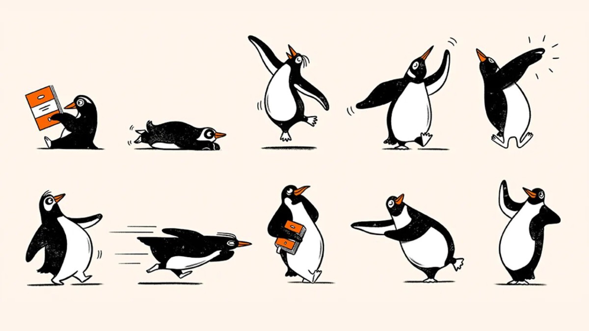
The publisher’s signature penguin, long confined to a static pose within an orange oval, now leaps into action through the new “Playful Penguins” series.
These drawings depict the bird jumping, strutting, dancing, and even reading, designed for use in seasonal campaigns, social media efforts, and retail displays across global markets. The initiative arrives as the company nears its 100th anniversary. Derek Man, the UK design director, noted that last year’s 90th anniversary celebrations revealed strong public affection for expressive archival penguins from the Bristol collection. His team decided to expand the bird’s role while preserving the core logo as the masterbrand asset.
Man emphasized that the illustrations provide guidelines for dynamic penguin depictions, meeting the brand’s evolving needs into 2026 and beyond.
From Zoo Sketches to Global Icon
In 1935, Penguin Books founder Allen Lane chose the name “Penguin” for its blend of dignity and whimsy, a suggestion from his secretary.
He tasked 21-year-old illustrator Edward Young with sketching live penguins at the London Zoo. Young’s loose, energetic drawings captured the birds in motion, fueling early ads that teased “The penguins are coming.” Over decades, designers refined the logo: a 1937 dancing version faced right, a 1939 update turned more serious, and Jan Tschichold’s 1946 rendition added bold lines and tucked wings, setting a lasting standard.
Pentagram’s 2003 slimmed-down iteration, with its upturned beak, remains the basis for today’s lozenge-enclosed penguin, known internally as “Alan.”
Behind the Scenes of the Brand Refresh
Following the 2013 merger of Penguin Books and Random House, the company standardized on the single core logo to ensure consistency.
The 90th anniversary success prompted Man to commission London illustrator Matt Blease, who immersed himself in archives and penguin footage. Blease described the process vividly: “I became part penguin for this project. I spent hours watching footage of how penguins walk, twist, turn, and slide.” He sketched family members of “Alan,” ensuring visual distinction through varied forms and textures.
- Early 1930s: Edward Young’s playful zoo sketches launch the brand.
- 1946: Jan Tschichold refines with thicker lines.
- 2003: Pentagram updates for modern use.
- 2025-2026: Playful Penguins expand creative options.
This controlled playfulness allows teams to engage audiences without diluting the iconic logo’s recognition.
Guiding the Penguin’s Future
Man explained that the new assets channel archival spirit into contemporary applications, maintaining cohesion across platforms.
Blease’s analogue warmth bridges the publisher’s heritage with forward-looking campaigns. The illustrations honor nearly a century of evolution while adapting to digital and retail demands.
Key Takeaways:
- The core “Alan” logo stays unchanged as the primary brand mark.
- Playful Penguins draw from archives and real penguin behaviors for authenticity.
- Global rollout targets campaigns ahead of the centennial milestone.
Penguin Random House’s strategic refresh demonstrates how brands can honor icons while embracing vitality – what role will these penguins play in your next reading discovery? Share your thoughts in the comments.