
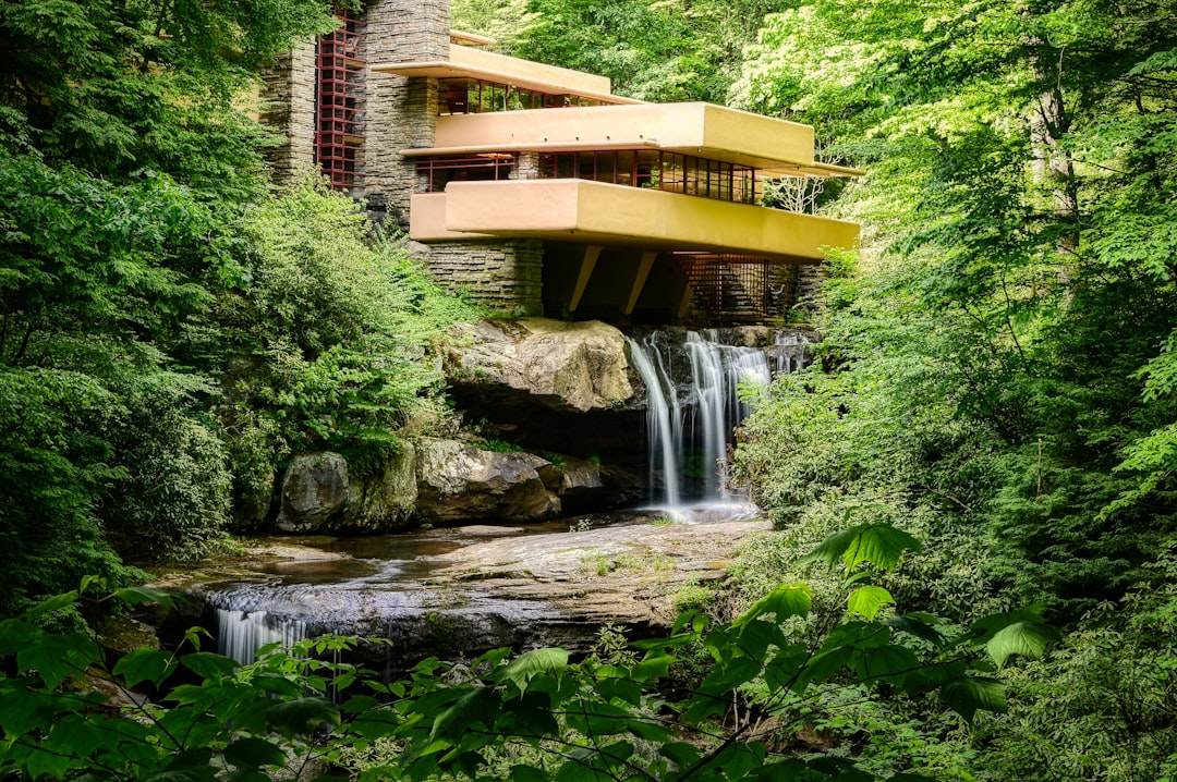
The House Itself Becomes the Ultimate Symbol (Image Credits: Unsplash)
Pennsylvania – Fallingwater, Frank Lloyd Wright’s masterwork cantilevered over a rushing stream, completed a significant rebranding effort last week. The update introduces fresh typography and colors drawn from the site’s natural surroundings. Notably absent is any graphic logo, a deliberate choice to preserve the home’s unparalleled visual power.
The House Itself Becomes the Ultimate Symbol
Efforts to encapsulate Fallingwater’s essence in a logo always fell short. Designers recognized that the structure’s famous silhouette – those bold terraces hovering above the falls – carried too much inherent meaning to reduce into a simplified icon. Amy Blackman, founder of Los Angeles-based Fruition Co., which led the project, explained that such compression would dilute the site’s richness.
Fallingwater director Justin Gunther echoed this view. He noted that the signature perspective of the house over its waterfall defined the visual identity. Any graphic attempt to replicate it failed to capture the full impact, he said.
From Literal Depictions to Typographic Restraint
Previous logos drew directly from the building’s form. Some rendered the rectangular block facade overlooking the water in stark realism. Others abstracted it through brush-like strokes or geometric shapes.
- Realistic outlines emphasized the home’s precise lines.
- Abstract versions used flowing lines to suggest movement.
- All shared a reliance on the architecture’s profile.
The new approach pivots to a wordmark. It employs a customized Aldus Roman serif typeface, originally featured on the 1986 book cover for Fallingwater: A Frank Lloyd Wright Country House by Edgar Kaufmann Jr. Subtle modifications enhance fluidity: the L’s gained curved tails, and the W received a gentle tilt. A compact “FW” favicon supports digital use in tight spaces like browser tabs.
Colors and Fonts Echo Nature’s Palette
The rebrand extends beyond text to an expanded color scheme. Hues reflect the local landscape and materials like native stone and wood that Wright incorporated. Updated fonts complement this earthy tone, creating cohesion across print and digital platforms.
This harmony reinforces the site’s organic integration with its environment. Visitors experience the same sensory connections through branding that they do onsite. The result maintains accessibility while honoring Wright’s philosophy of harmony between structure and nature.
A Trend Among Wright’s Legacy Sites
Fallingwater joins other Wright-affiliated organizations in moving away from building-specific icons. The Frank Lloyd Wright Building Conservancy recently replaced a logo depicting a Buffalo structure with a square emblem symbolizing preservation efforts. These shifts prioritize broader narratives over singular representations.
| Previous Approach | New Strategy |
|---|---|
| Building silhouette as logo | Wordmark or abstract symbol |
| Limited adaptability | Versatile across media |
| Risk of oversimplification | Evokes full essence |
Designed in 1935 for Pittsburgh department store magnate Edgar Kaufmann Sr., Fallingwater now operates as a museum and UNESCO World Heritage site. It attracts roughly 140,000 visitors each year. A continuous YouTube livestream of the falls offers a serene window into the property year-round.
Key Takeaways
- Fallingwater’s architecture is irreplaceable as a brand symbol.
- Typography and nature-inspired colors provide flexible identity tools.
- This logo-free model aligns with evolving strategies for iconic sites.
Fallingwater’s rebrand proves that sometimes the best identity emerges from restraint. By stepping back, the team allowed the architecture to command attention as always intended. What do you think of this logo-less approach? Share your thoughts in the comments.