
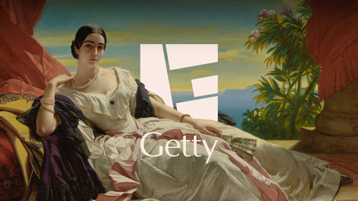
Stepping Away from a Design Icon (Image Credits: Images.fastcompany.com)
Los Angeles – The J. Paul Getty Trust introduced a dynamic new logo that consolidates its museums, conservation efforts, research programs, and foundation into a unified visual system.
Stepping Away from a Design Icon
The trust, established in 1953, oversees the Getty Center and Getty Villa museums alongside specialized institutes. For nearly three decades, Saul Bass’s 1997 logo defined its presence. That square emblem featured oversized, fragmented letters spelling “Getty” in a deliberate scatter. Officials described it as iconic yet ready for evolution.
Leaders commissioned Fred & Farid New York to craft a successor. The agency delivered a mark that nods to Bass’s geometry while embracing modernity. This shift aimed to reflect the organization’s expanded global footprint.
A ‘G’ Built from Symbolic Blocks
Four geometric shapes form the core letter ‘G’ within a square frame, representing the trust’s four main pillars. Designers drew inspiration from the travertine blocks cladding the Getty Center. Fred & Farid creative chair Farid Mokart explained to reporters that the form conveys weight and purpose.
This structure allows the logo to serve as a frame for artworks and sculptures. Early uses show pieces emerging from its edges, injecting vitality into applications. The design maintains abstraction to suit broad contexts without losing distinctiveness.
Flexibility Across Diverse Programs
The trust’s entities serve varied groups, from free-admission museum visitors to professionals in conservation and scholars in research. A single mark demanded careful balance. Planners ensured it adapts seamlessly, whether rearranged or overlaid with imagery.
Here are key elements enabling this versatility:
- Modular shapes that shift positions.
- Open structure for integrating collection highlights.
- Scalable form for digital and print media.
- Neutral base compatible with bold accents.
- Square proportion echoing the original Bass design.
Colors, Tagline, and Global Ambition
The updated palette centers on the trust’s signature cobalt blue, augmented by vibrant hues pulled from its architecture, gardens, and holdings. Yasmine Vatere, assistant director of brand management and marketing, stated, “We needed a visual identity that was uniquely Getty and distinct enough to unify how we show up globally.”
A new tagline, “All for Art,” accompanies the rebrand. Vatere added, “This system gives Getty one clear, ownable expression in support of the work we do around the world.” These choices position the identity for international outreach.
Key Takeaways
- The logo symbolizes unity through its four-block ‘G’ tied to the trust’s programs.
- Inspiration from travertine ensures a tangible link to the Getty Center’s materiality.
- Adaptive design meets needs of public, professional, and academic audiences alike.
The rebrand marks a pivotal update for an institution blending public access with scholarly depth. It promises enduring relevance in a crowded cultural landscape. What aspects of the new logo stand out to you? Share your thoughts in the comments.